
WEEK ONE: COLOUR
TASK 1: Using complimentary contrast for one, harmonious for the second and a range of pastel shades for the third. Design three album covers for the following albums
Album 1: Steve Reich: Music for 18 musicians.
For the Steve reich album cover, I chose to use harmonious colours
I started by using the he colours green and yellow, but I wasn’t happy with how it looked and decided orange and yellow looked better. I wanted this album cover to be abstract because in my opinion it fits the style of the music. The reason I ended up choosing the last one with the different shapes is because of the way the music changes throughout his songs, it doesn’t keep a steady beat so I thought it worked for his album.


Album 2: John Coltrane: Impressions
For this album cover I used complimentary colours, meaning colours that are opposite I the colour wheel.


Album 3: Joni Mitchell: The hissing of summer lawns


TASK 2: Using only letter forms, create six digital typographic designs.the essence of each design is to be created using the typefaces listed below in combination with as many colours as you require to answer problem undertaken
FONTS: Bodoni, Rockwell, Helvetica, Clarendon, Calibri, Myriad Pro
PROBLEMS: Feminin, Masculin, Playfull, Pattern, Scale, Power
Problem: Feminim, Fonts: Clarendon, Helvetica
For the feminism I tried to stick with colours that are often considered ‘for girls’ for example pinks. I chose the font Clarendon as it was as bold as the others and I also chose to go with lowercase letters as I planned to use uppercase for the masculine one.


Problem: Scale, Fonts: Bodoni, Helvetica
I had the most fun with this one, just playing around with what colours I could use, the composition and the opacity of the letters. I Think that the black background works well against the yellow and orange letters and makes then standout more rather than the blue.


Problem: Masculin, Fonts: Rockwell, Helvetica
For the colours I chose to use blues and red as in a toy aisle in a shop, most of the toys aimed at males/boys use these colours along side bold strong fonts.


Problem: Power, Fonts: Rockwell, Myriad Pro
Red and black create a strong visual contrast which makes it work for the problem powerful.

Problem: Playful, Fonts: Calibri, Myriad Pro
I chose to use primary colours for ‘playful’ because it made me think of primary school. I Chose the font Calibri as to me it felt childish and that show wanted this piece to be

Problem: Pattern, Fonts: Rockwell, Helvetica


WEEK TWO:COMPOSITION
TASK: Design 3 A5 book jackets (front only) in the style of each designer for the following three novels
Trainspottting


They are four inseparable friends who share a childhood, a city, neighbours, unemployment. And above all, an applied devotion to a single horn in the shape of a syringe. We hear these four, we listen to them: each one tells their story of Edinburgh, between two pints of beer, after a fix, before a cup of tea, or during a fight with a sharp knitting needles. we see the bodies eaten by the virus, the drugs, the hallucinations, and then something stands out: we are from Edinburgh, but like we are from Fresnel or la Sante. we must escape. A cult book from 1990s, Trainspotting was brought to the screen by Dany Boyle.
https://www.google.com/url?sa=t&source=web&rct=j&opi=89978449&url=https://www.goodreads.com/book/show/23955.Trainspotting&ved=2ahUKEwjNwvDDmouRAxWGV0EAHcz1G0QQFnoECFUQAQ&usg=AOvVaw28SvfREJ_NgfGznB36w06i
Wuthering heights


Emily Brontë’s only novel, a work of tremendous and far-reaching influence, the Penguin Classics edition of Wuthering Heights is the definitive edition of the text, edited with an introduction by Pauline Nestor. Lockwood, the new tenant of Thrushcross Grange, situated on the bleak Yorkshire moors, is forced to seek shelter one night at Wuthering Heights, the home of his landlord. There he discovers the history of the tempestuous events that took place years before; of the intense relationship between the gypsy foundling Heathcliff and Catherine Earnshaw; and how Catherine, forced to choose between passionate, tortured Heathcliff and gentle, well-bred Edgar Linton, surrendered to the expectations of her class. As Heathcliff’s bitterness and vengeance at his betrayal is visited upon the next generation, their innocent heirs must struggle to escape the legacy of the past.
https://www.google.com/url?sa=t&source=web&rct=j&opi=89978449&url=https://www.goodreads.com/book/show/32929156-wuthering-heights&ved=2ahUKEwjnism6m4uRAxWDU0EAHReALYIQFnoECGEQAQ&usg=AOvVaw1q9WVtnHau1VnBaKRPt4o4
The wind in the willows


Spring is in the air and Mole has found a wonderful new world. There’s boating with Ratty, a feast with Badger and high jinx on the open road with that reckless ruffian, Mr Toad of Toad Hall. The four become the firmest of friends, but after Toad’s latest escapade, can they join together and beat the wretched weasels?
https://www.google.com/url?sa=t&source=web&rct=j&opi=89978449&url=https://shop.penguin.co.uk/products/book-bundle-the-wind-in-the-willows%3Fsrsltid%3DAfmBOoo9u548jnkJQkRBwBs2gBKmKLP0rPT4_Q-g9Q-FBzfnwxy3Z5_T&ved=2ahUKEwi_6-_hm4uRAxUQYEEAHTQ-KdUQFnoECG4QAQ&usg=AOvVaw2XriSRyAl8TNdKQTPmQysO
Peter Grundy’s Work

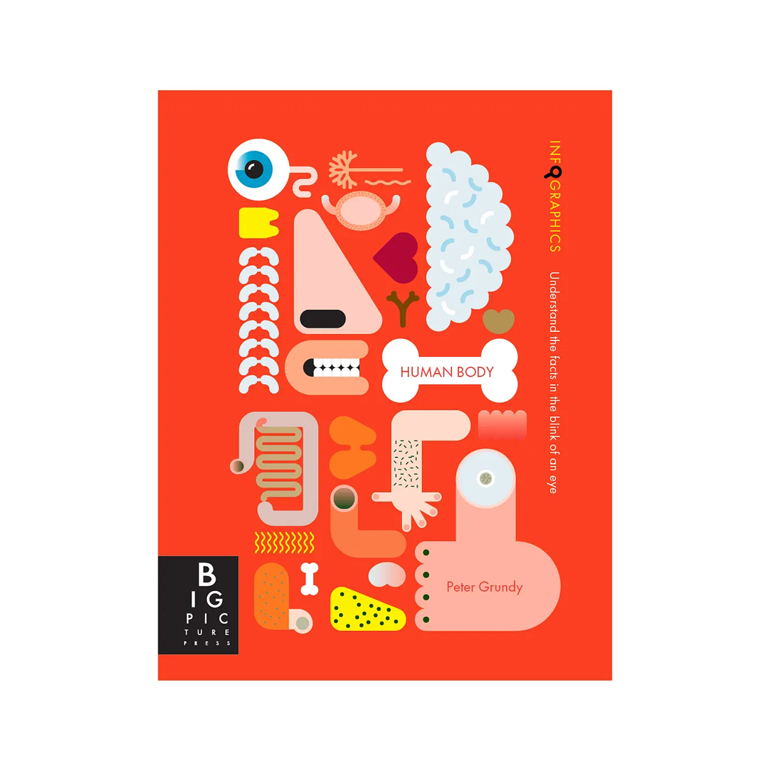


Here is my attempt to copy Peter Grundy’s work to experiment with using illustrator in the same style of his artwork. I chose a simpler piece just to get the idea.


The artwork I had a go at copying


For the book cover of wind in the willows I wanted to have the animas (the characters in the book) as the main subject and ry my best to use Peter Grundy’s style. To start I made the body of the dead which I then copy and pasted to use for the other three animals which helped make sure they were all the same. For the font I chose impact and also tried in yellow and blue. the blue definitely works better as the yellow doesn’t work infant of the white clouds. Once I had thought I was happy I realised that in Peter Grundy’s work you will hardly ever see any sharp corners so I made the decision to round the edges of the boat.


Final outcome

El Lissitzy’s work
Lissitzky’s graphic design was highly influential on production and style used in 20th-century design. Specifically, his use of a dominating diagonal axis, the use of minimal flat colours, the use of sans serif fonts, and simple geometric forms influenced early and late 20th-century graphic design.
https://www.google.com/url?sa=t&source=web&rct=j&opi=89978449&url=https://study.com/academy/lesson/el-lissitzky-artwork-architecture-design.html%23:~:text%3DLissitzky%27s%2520graphic%2520design%2520was%2520also,late%252020th%252Dcentury%2520graphic%2520design.&ved=2ahUKEwj7lODbk4uRAxVBZ0EAHWLhJBQQFnoFCIUBEAM&usg=AOvVaw14nSmVMe9ERHN7W-x2u5YS
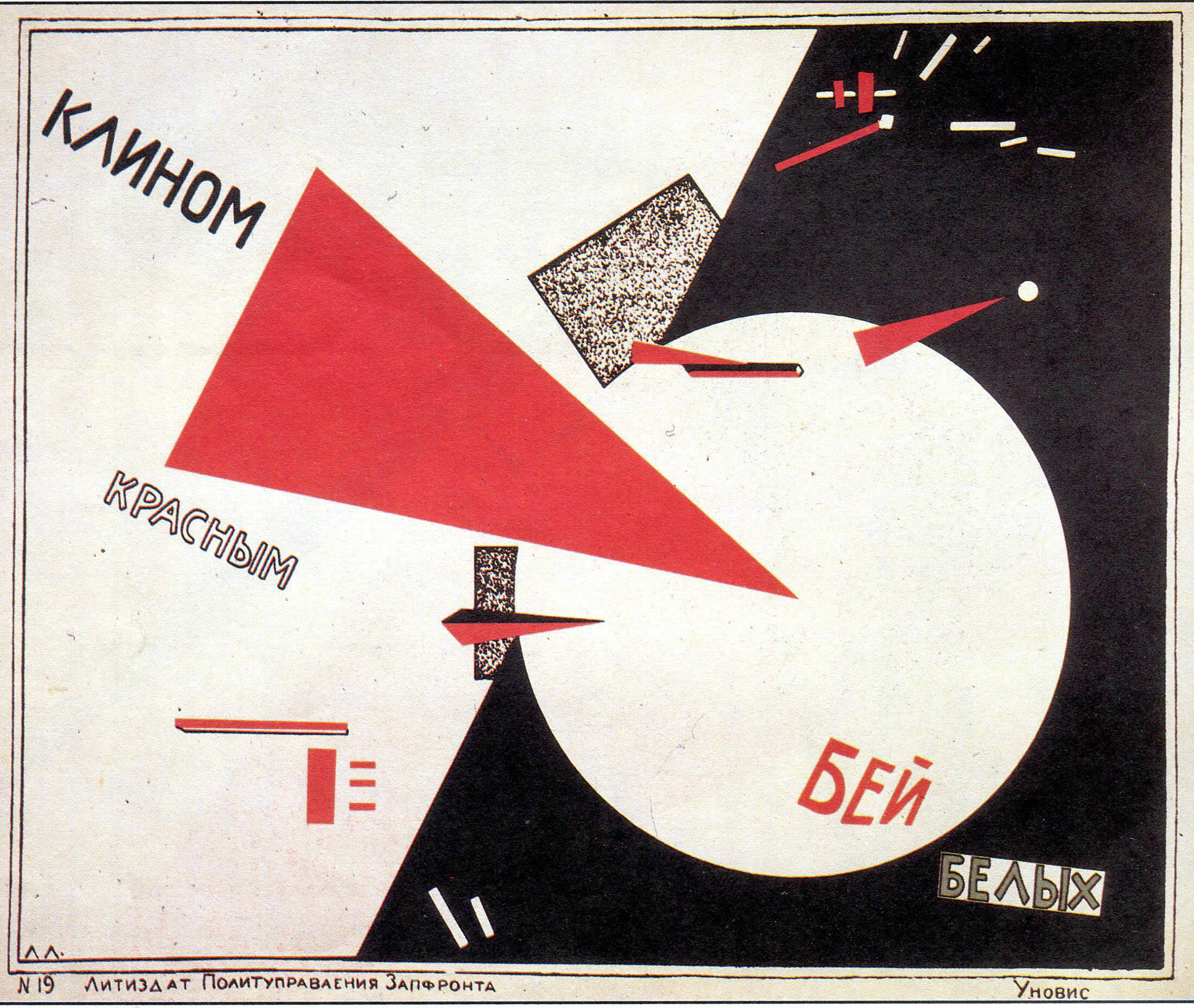

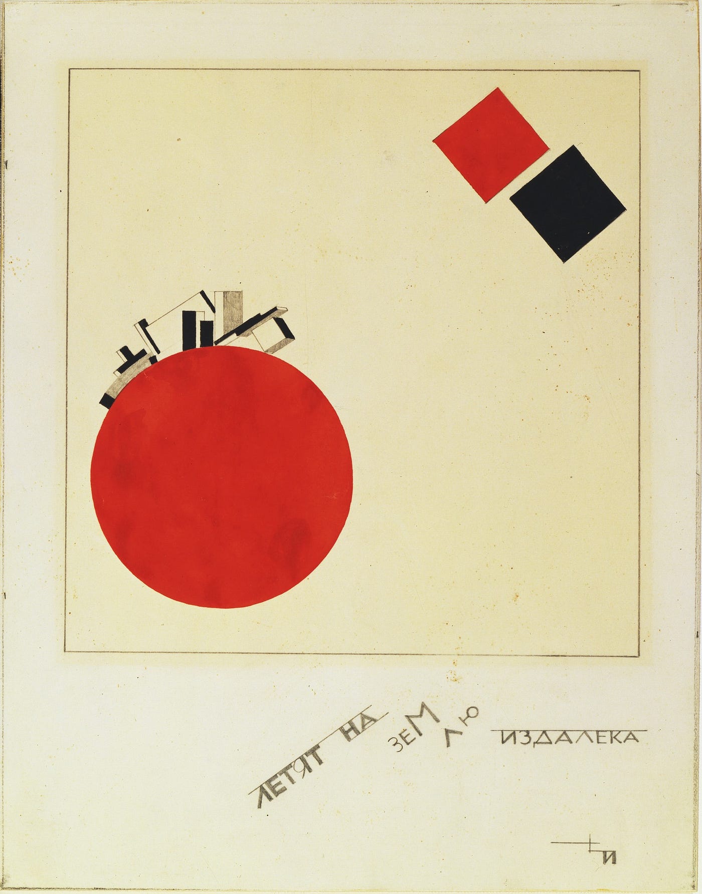


For the Trainspotting cover chose to use the influence of El Lissitzky because one of his pieces of artwork reminded me of a skull, and from what I’ve seen skulls seem to appear on covers for Trainspotting, so I used that for inspiration to make my own skull. El Lissitzky was known for using bold sans-serif and slab-serif typefaces and using type diagonally so made sure to incorporate this in my design,using a sans-serif font.


final outcome

Vaughan Oliver’s Work
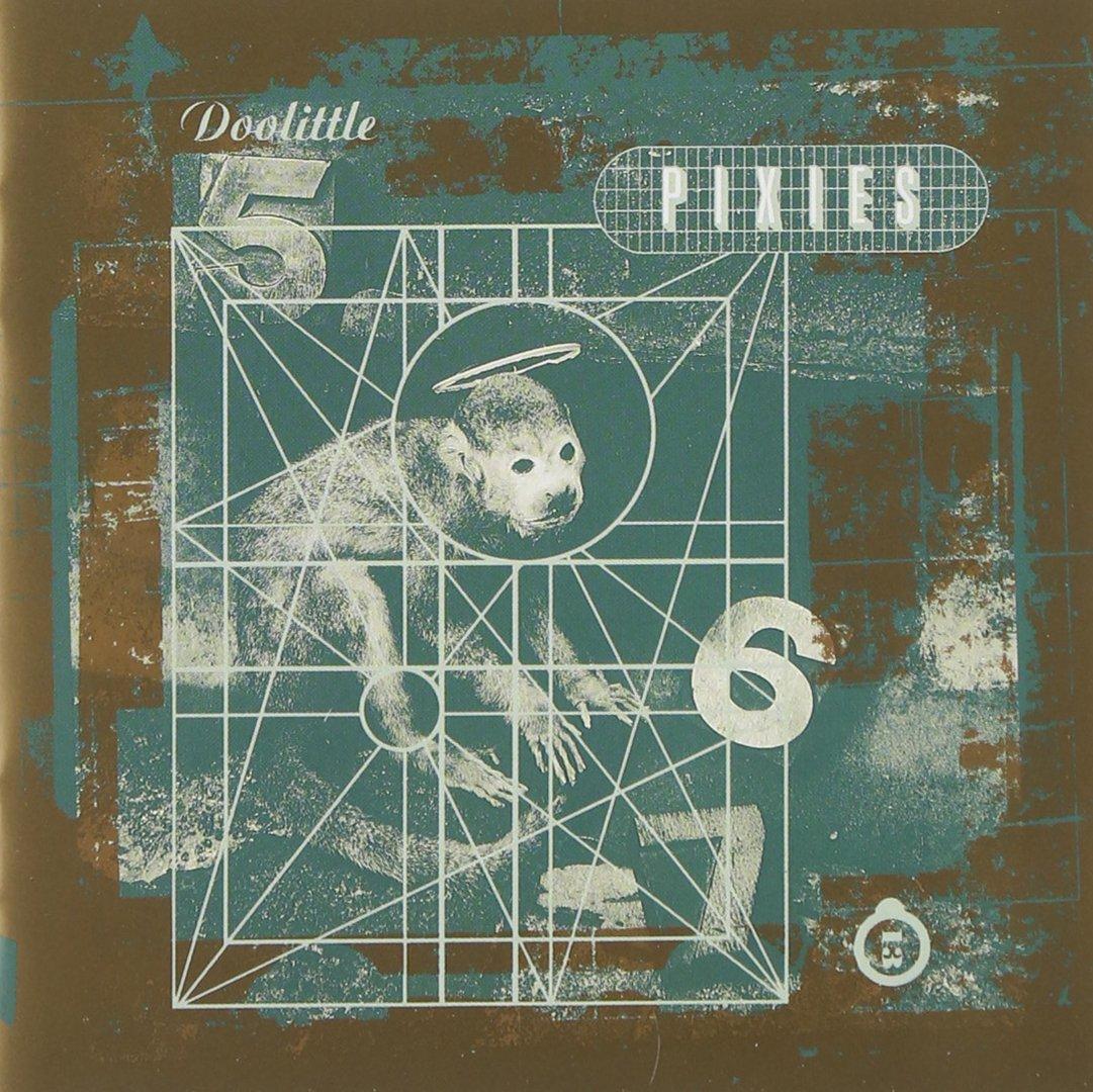


DB: texture is a big part of your own work…
VO: yes it is, but I can’t say exactly where that comes from – maybe playing in the mud as a kid! what I like about texture is that it has history, it’s suggestive, provocative… I prefer that much more than something pristine.


Vaughen Olivers work was the one I found most difficult to use in the same style, to try get an idea I started by using a photo I had taken and using photoshop to edit in a way that would hopefully represent something in his style.


This was my first attempt at using his style. I used a photograph I had taken and edited on photoshop, but when adding the font brush script, I chose the wrong script font and it just doesn’t work.


After more thought of how I cold improve this work, I found a video tutorial on how to make a photo look like a its was taken on a wet plate camera using photo shop and I was much more pleased with how this turned out. I also spent more time finding a better script font, which was Zapfino and the whole thing turned out better than my previous attempt and copying Vaughan Olivers style.
Final outcome

PROJECT WEEK
Brief: Create an 8 page issue book, the book is your personal response as a graphic designer to the lyric of one of the following songs:
- magic (ben folds)
- sport (the odd boy)(Bonzo dog doo-dah band)
- rossmore road (Barry Andrews)
- my sister (Julianna Hatfield three)
- the bright light (tanya Donnelly)
- les fleurs (Minnie riperont)
I choose the song Rossmore road
Initial ideas through thumbnails:

At first the plan was to collage each page differently but because the whole song is about The road in London ( Rossmore road ) chose to use the same image as the background for each page and collage images to represent each paragraph.


Feedback given:
- To predictable using the same background for every page, will bore the reader.
- When the song picks up, you would expect the pages to as well but they don’t.
How I would like to act on this: Using google maps, I could use photos that move down Rossmore road, maybe even using the different years aswell. I would like to stick with the idea of black and white background and using red or yellow to highlight things on each page
Some quick ideas:

