
PERSPECTIVE
As a graphic designer it is important to understand perspective to be able to to draw realistic and accurate representations of the things in the world especially if we are present an idea to a client, we want them to fully understand fully the concept of the idea.
Task 1 : Play with eye-level/horizon within the frame and move cubes and boxes around.


Task 2 : Play with ‘fences’

Task 3: Show of with grids/chess boards

Task 4: Draw ellipses/cylinders in at different positions within the picture plane.
Use shadow and light


three point perspective

By the end of the week I would say I’m definitely confident with one and two point perspective drawing boxes and cubes, which can be used as the base to draw more complicated things
INTRODUCTION TO TYPOGRAPHY
Task: Using the copy of the text, Produce three black and white( also means a full range of grey) typographic designs which present the text in a visually stimulating and attractive way and help the reader to understand the information.
- format 1: 160mm x 160mm
- format 2: 115mm x 207mm landscape
- format 3: 245mm x 100mm portrait
Restrictions:
- One type family, as many variants and sizes
- Two typefaces and Two sizes
- One typeface in one size, but as many weights

Feedback on the thumbnails: As a graphic designer, you should be able to easily imitate a font in a thumbnail so that it gives a better idea of how it will look in the final design.
The restriction I chose for this poster was, one the family with as many variants and as many sizes. In the feedback session was pointed out the the outline the grey box make it look unprofessional so I planned to get rid of that, also pointed out was that a reader would most likely go from the title to piece of text next to it instead of he important information underneath, so again I intended to change then around.


The restriction used for this poster was one typeface in one size but as many weights. I should have spent more time on this one and been more paranoid as I made the mistake of using centred text, which is least common and usually used for wedding invitations or for funerals


The restriction I used for this one was two typefaces in two sizes. Again with this one I should have been more paranoid as I hadn’t double checked before the feedback session and I had accidentally had 2 typefaces in the same paragraph, I should also have made sure the writing didn’t have such big gaps as it makes it more uncomfortable to read, I have since changed this.


‘Super troopers’ is the type of light which I actually found out after designing this poster so I thought it would be more fitting to swap the colours around to give the impression that it is a show light shining down.


Acting on feedback: Ive learned that as a graphic designer I need to be extremely paranoid about my work before presenting final designs.


BRIEF: Working on A3 layout paper, generate at least 40 different thumbnail ideas for a portrait format theatre poster. As the week progresses, select five ideas to develop and refine.
Select the best three from this group of five, doubling the size and spending a little longer producing them.
I choose the the theatre play Blithe Spirit, a comic play by Noel Coward


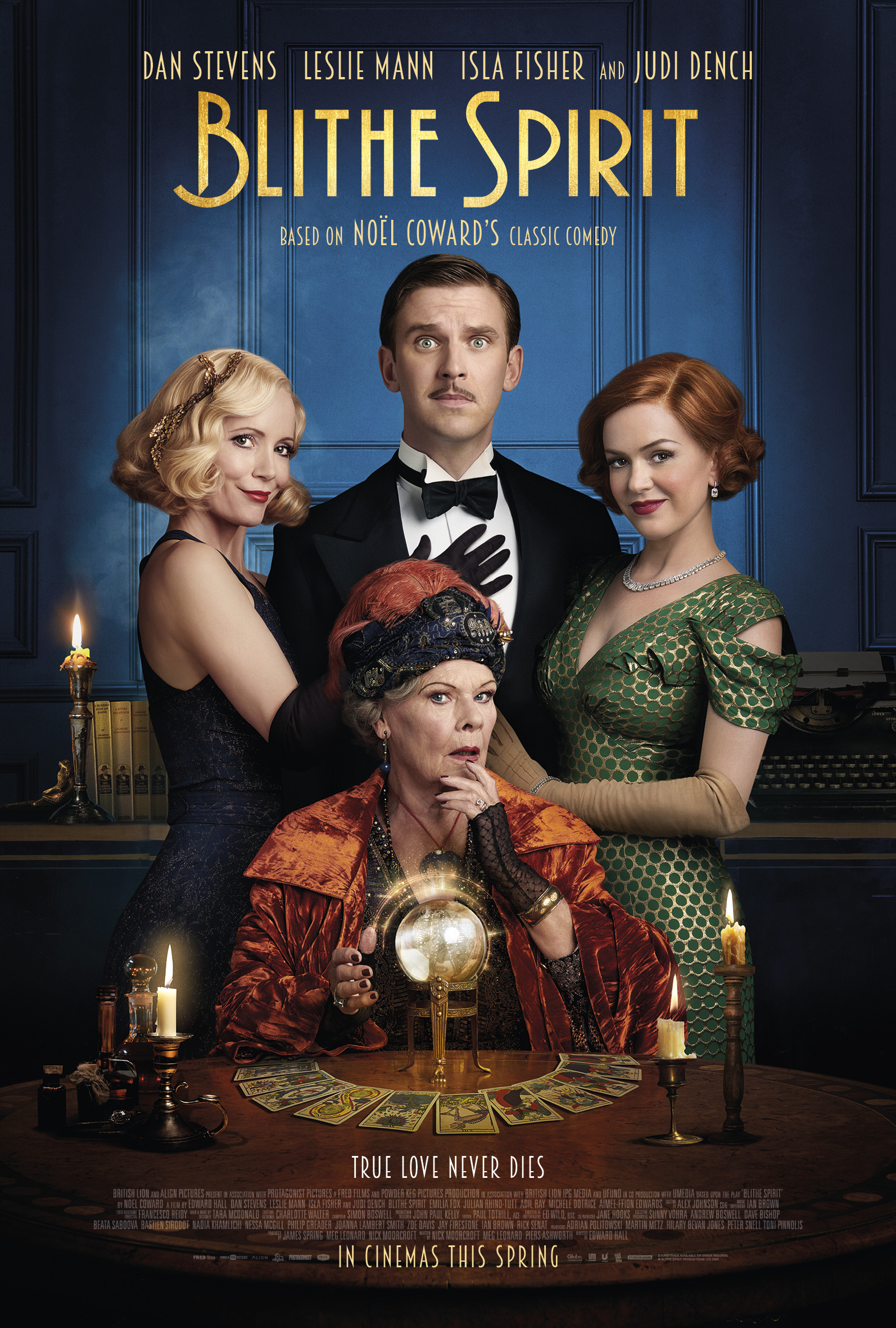
At the start I thought it would be hard to think of 40 ideas but once I began getting ideas down it became easier even though some are quite similar to each other. I stuck with very similar colours throughout, as I liked how the blue and yellow worked together, and looking at the plays posters blue and yellows appeared a few times.


These are the five designs I’ve chosen to take further before choosing three to design I more detail

Final designs:
I choose the font minion pro because I felt like and older font that would fit the time the play is set.


